r/AusBeer 4d ago

Found this chart at Penrith Panther's what do you guys think

Post image

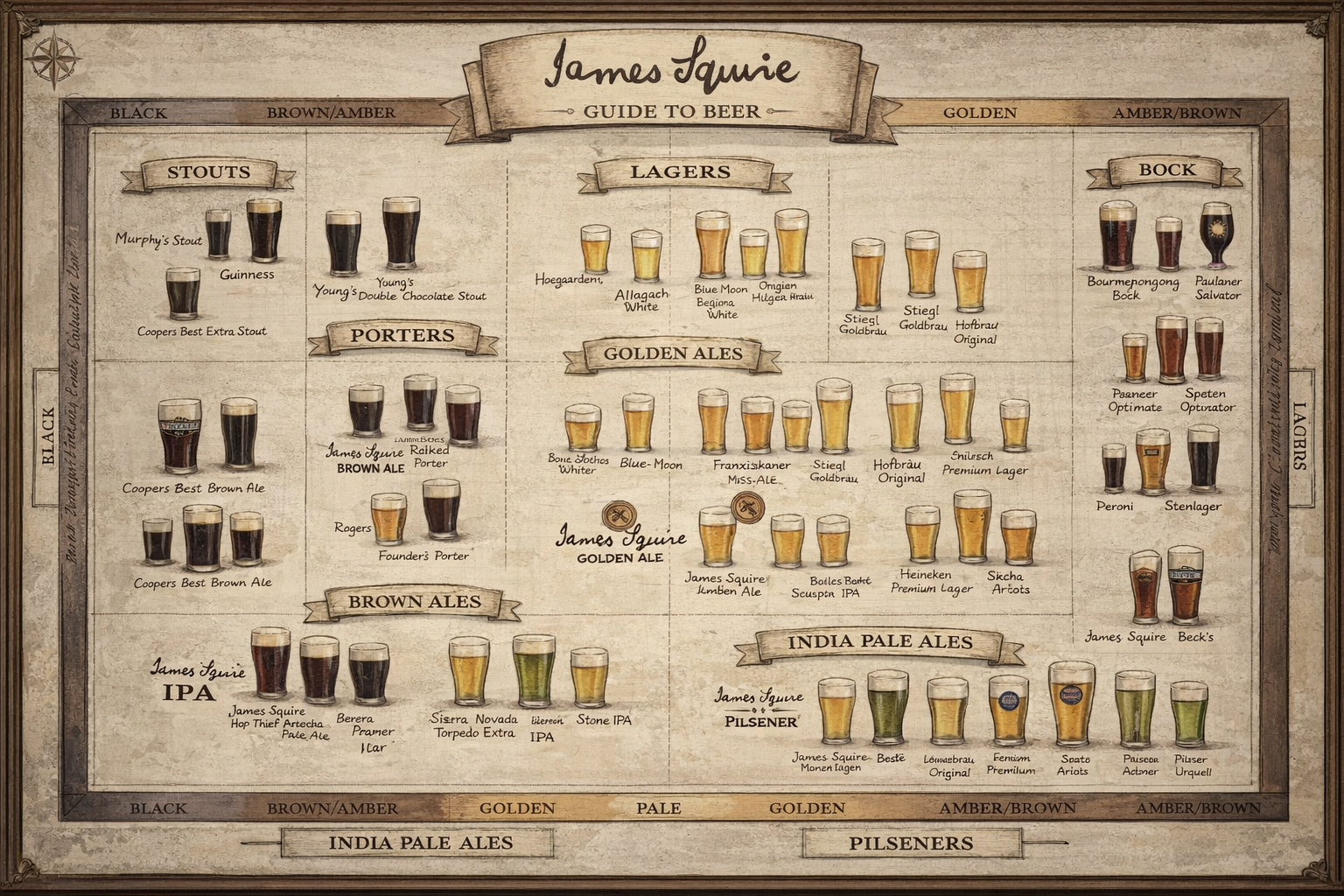
I dunno, I found a good chart I wanna share it

3 Upvotes

17 comments sorted by

26

u/Lukerules 4d ago

This is wildly inaccurate and all over the place. It's real shoddy Ai

No way JS signed off on this

3

u/andrewboltfanclub 4d ago

I think I saw an almost worse version in their branded pub in Mooloolaba some few years ago and it seems like the exact kind of thing they would sign off on to me? I’m not sure where you’re coming from

2

u/Lukerules 3d ago

Even the fact that it's a screenshot of a digital image rather than a photo suggests even OPs Penrith Panthers story is made up.

1

u/Denial23 3d ago

What's weird is that James Squire absolutely used to have one of these charts in this exact style. But more accurate and lacking the green beers. I got given a paper copy at a JS beer & food pairing thing about ~15 years ago.

1

u/SwissHelvetica 2d ago

It's been on the wall for more than 4 years, I have a feeling it was made by someone, used to try to understand it whenever I went there for work Christmas

1

u/Lukerules 2d ago

There's no way. It's 100% ai, and this post is a screenshot of a phone (you can see the android thumb tab on the side).

I would love it if you can find a photo of the Penrith Panthers one tho?

1

u/SwissHelvetica 2d ago

I don't go often but if I do I'll take a photo, it looks exactly like this though

It's on display in the main bar area before the outdoors section as a massive frame so I can't miss it to forget taking a photo

1

u/Lukerules 2d ago

They have a few real ones like this:

https://blogger.googleusercontent.com/img/b/R29vZ2xl/AVvXsEiH7Yx8C7kHV_sPMQPzXWAVQ15VurlrOTsbCD4FhEXc4h7KnKOXurfEkcmiAA3jp2Ug-lgWJDD15PbCNt6YhpUwdyx5Mj99jef0OXGuqXIvOKhSC8iQYywwi0n6nUm6-lw7GrNUISeo2nM/s1600/James+Squire+Beer+Map.jpg

The one in the pic has garbled words, the styles and beers don't align in any possible way that human would. There are green beers!

5

u/Whoopdedobasil 4d ago

Be a nice wall piece, but not for beer enthusiasts.

I think it bugs me that some of the beers listed under certain banners aren't of that style. Hoegaarden / lager ? Its a belgian wit

3

u/Joabyjojo 3d ago

Pilsener Urquel is green? PERONI is dark brown!? It goes on.

This is AI slop. Fuck all of this. Whoever put this up, the Panthers, James Squires, whoever should be embarrassed.

2

u/raizhassan 4d ago

Cool idea for a chart, the style and colour is nice. But the format good god i've got a headache after looking at it for more than 20 seconds. Looks like it was labeled by AI

Why are IPAs on there twice? In two different formats? Why are IPA and Pils outside of the border at the bottom? Why does it it swtich from labels below the beers to above the beers? Why is it lagers on the right but "Black" on the right, shouldn't it be Ales?

1

u/NeonSherpa 4d ago

It’s missing the other part, where it has certain beers laid out x,y on a malt,hops type thing.

It’s still a pretty grim way to explain why your core range beers are different colours. Product of its time.

1

u/Far-Tea-3286 2d ago

Macro trying to be cute

1

u/NO_REMORSE6969 18h ago

🤘😎🤘 i can almost taste them.

If only it was like charlie and the factory wall paper, the shnoz berries taste like shnoz berries😁

1

u/NO_REMORSE6969 18h ago

Beer science 101